Skip to main content
How to Do a Benchmark Comparison with the Bar and Whisker Chart
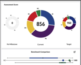
- One of the most important features of the Axio360 Platform is the ability to do a benchmark comparison against the data that we already have in Axio360 from other customers in your region.
- This benchmark comparison is done through the bar and whisker chart.
- The bar and whisker chart is shown below and can be expanded by selecting the expand icon on the top right of the Benchmark Comparison window.
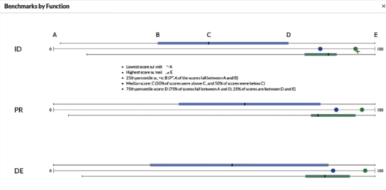
- This will allow you to see the bar and whisker chart for each of the functions in your organization. As your scroll down you can see the different benchmarks by functions.
- But what do the bars and whiskers (dots) represent?
- The values between B and D represent between 25% and 75% of responses.

- C is the median score of all responses, meaning that 50% of scores were above C and 50% of scores were below C.
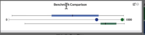
- The blue dot represents the actual score for that specific Function within a company's assessment compared to the rest of the industry.
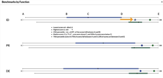
- The green dot represents the target value for that specific Function within the company's assessment
- The green dot in the Benchmark Comparison is a representation of the target score (on the far right in the screenshot above) for that specific Function within the company's assessment
- The green bar represents exactly what the blue bar represents (benchmark scores), except that this is the target scores for the industry